When I left my design studio job in late 2018, I was burnt out and looking to rediscover my creativity. For the longest time, I had aspired to complete the type design program at Old School New School, inspired by the likes of Monique Aimee and the way it shaped her as both a lettering artist and type designer.
I took the jump and enrolled. However, the course had been restructured considerably into a two-week intensive. Week one was an intense look at 'Old School' lettering, and week two, taught by Dan Milne from Monash, was a deep dive into type design using Glyphs.
During the second half of the course, I discovered that I have a particular fondness for the systematic modularity that makes a suitable typeface. I loved pushing things 1-2mm over to see the enormous difference it made to the characters.
I worked independently on some projects but took the opportunity to enroll in Troy Leinster's Type Design course through AGDA. It was a joy spending every Saturday morning with like-minded type nerds and learning how to use Robofont to design more complex typefaces.
Miss Sutton
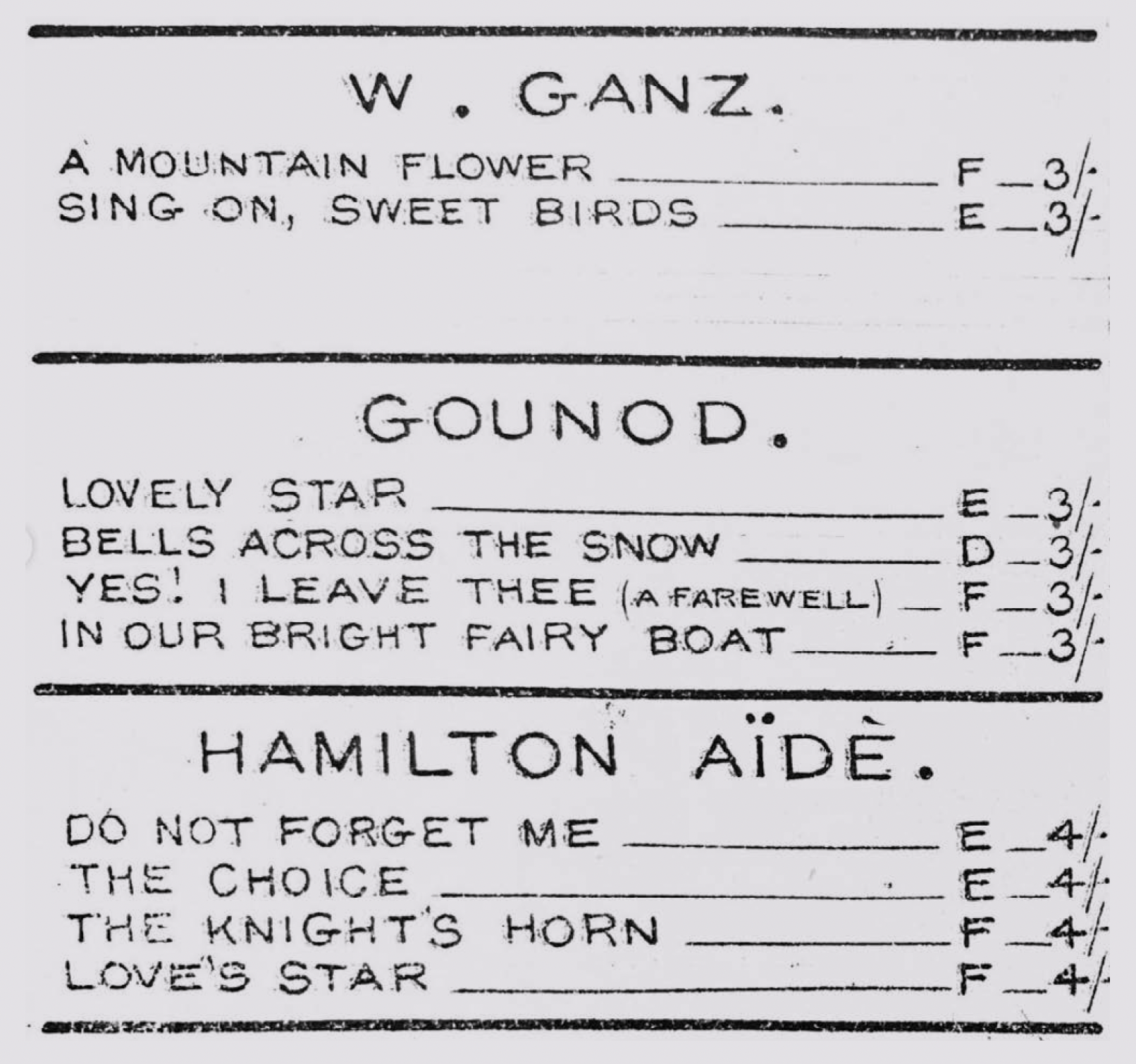
Miss Sutton is based on a sample of text I found in an old sheet music book collated by a music teacher named Miss Sutton. By analysing the structure of the type, I established that it was not typeset using movable metal type; instead, the author hand-etched it into metal and printed it using traditional intaglio printmaking. Because of its unbelievably consistent letters, it quickly earned the nickname 'superhuman handwriting’.
Designed in 2019 at Old School New School, under the guidance of Dan Milne from Monash University.


Bevel
BEVEL was a type design project that I undertook to further my understanding of how Glyphs type design software handles counter spaces within the type. It's based on handmade letters I created, which explores the expected, tried and tested 3D bevelled type. There are likely a million and one typefaces like it, but I learnt a lot about how to structure letterforms within Glyphs.
Designed in 2019, independently.


Exchange
Exchange is a labour of love I'll probably work on for the rest of my life. It's based on the iconic lettering that adorns the old Fruit & Produce Exchange on East Terrace.
I want to acknowledge that this has been done before by one of my favourite SA studios, Voice. I initially developed this typeface to be as close to a replica of the original lettering as possible. However, I have slowly moved away and focused on turning it into a consistent and functional typeface instead of a piece of lettering.
Currently in its third iteration.
Designed in 2020, independently, with feedback from an online ‘Typathon’ forum of other graduates from Old School New School.


Agnes
Agnes, named after Ernest Hemingway's great unrequited love Agnes von Kurowsky, is a semi-bold translation model display typeface with stencil features. Translation is a type design convention that mimics lettering traditionally done with a a broad-nib pen held at an angle.
This was my first full-character set, including punctuation, and I aimed to create a typeface that was more traditionally structured to push my attention to detail and consistency to prepare me for undertaking a reading typeface.
Designed in 2021 under the guidance of Troy Leinster.


Current Project
I wanted to make more type this year, so I bought a beautiful daily dotted grid diary from Milligram. Each day, I plan to do a Typecooker¹ exercise with a word that describes the day. If I like the results, I'll take it into Glyphs² to keep developing.
1. What is Typecooker? It's an online tool designed by Erik Van Blokland, head of the Type Media Masters program at The Hague. It generates random "recipes" for drawing type.
2. Glyphs is a typeface design software. The interface gives you more control over your letters than Illustrator and makes it easier to output working typefaces.
